You are using an out of date browser. It may not display this or other websites correctly.
You should upgrade or use an alternative browser.
You should upgrade or use an alternative browser.
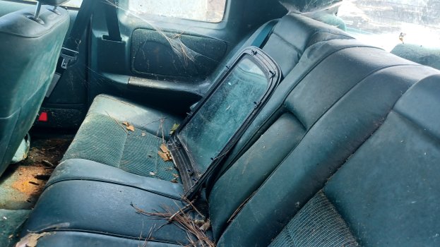
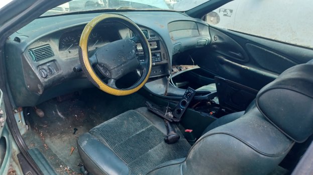
1995 Cougar 4.6; seen 04OCT23
- Thread starter 1997ThunderbirdLXV6
- Start date
The back seat looks fittingly spooky for the season! 
One of the Thunderbirds I had back in the 2000s was gold with the green interior. Seeing this interior reminded me of just how much they made everything green. I think even the steering wheel. Was green overkill. Of all the Thunderbirds I owned I had that one the least amount of time.This one is filthy. They wanted to replace the window (new one laying on back seat)...but then they said Nah...
View attachment 1186View attachment 1187View attachment 1188View attachment 1189View attachment 1190
I've always preferred black interiors, but green is my favorite color and something in me just wants to have one at some point...
The weird thing is the black interior option disappeared from the option list in 1994 with the new interior, yet this green was added to the options. I never understood Ford's rationale with that, 94-97 green interiors are pretty uncommon while black on the 90-93s seem pretty common. Plus it's neutral and could be ordered with any color, while the green interior was limited to certain exterior colors.
I absolutely loathe black interiors. Which is why I don't like so many modern interiors. It just says we didn't care, black is fine,...
There are very few exceptions among modern cars. Maverick comes to mind with its blue interior.
Especially the carpet looks so much better in lighter colors.
I will admit that some colors age better than others. The grey MN12 interiors seem to age worse, with the carpets often showing brownish wear. But the Prairie Tan or Saddle interiors often age flawlessly.
I absolutely loathe black interiors. Which is why I don't like so many modern interiors. It just says we didn't care, black is fine,...
There are very few exceptions among modern cars. Maverick comes to mind with its blue interior.
Especially the carpet looks so much better in lighter colors.
I will admit that some colors age better than others. The grey MN12 interiors seem to age worse, with the carpets often showing brownish wear. But the Prairie Tan or Saddle interiors often age flawlessly.
I haven’t seen a real black interior in a new car for over 20 years. What the manufacturers call black today is almost universally charcoal grey and there’s a big difference. My biggest gripes with modern car interiors are tacked on LCD displays, pleather seats or burlap cloth seats, and in terms of color the cheap “two toning” of say red seats with black dash and carpet.
Red physically ages the worst, carpets and cloth turn pink then white, even the vinyl es and plastic seem to pale out quite a bit. Grey and tan I’d call about even, that brownish wear is coming from the organic beasts that sit in the seats, so tan just hides it better, but it can be cleaned off/shampooed back usually.
As I've been doing some interior design planning lately with room remodeling explorations, I see the issue with interior colors in many older cars is being monochromatic. If an interior is going to be monochromatic, black works very well when bolder colors would be too garish, especially when there is only one variety of hard surface—molded plastic.
If I'm in a room, I don't want the entire room—carpet, ceiling, walls, chairs, furniture—to be one bold color. That's why neutrals tend to work better for monochromatic interiors. They're less assaulting on the senses.
Tan shades work for more of a natural look and go well with leather and wood. It's not a very good plastic color though. Gray works better with fuzzy surfaces but there's a range of medium grays that are dull and depressing in large amounts, and guess what shades of gray many automakers used? White is extremely popular right now for hard surfaces, but it needs splashes of contrast or else it looks too sterile. Black is sleek but makes a space look smaller.
A lot of those ideas become problematic inside of a car because of wear and staining. Black ages the best but also requires a lot of cleaning of loose material like dust, dirt, and dead grass. If the hard surfaces are matte, black absorbs glare, which is great. Of course, that's clearly not the case with many interiors today, but that's another story. Black can also conceal the character of the interior, which can be either a good or bad thing.
If the interior of the '94-97 MN12 wasn't defined by continuous swaths of a single texture like the dashboard, there would be natural breakpoints for inserting other textures and colors. Since that's largely absent, the red, green, or blue interiors end up being overwhelming. Given that, I'd rather the dominant color be a neutral color rather than a colorful one. Tying this back to Martin's mention of the Maverick's blue interior, it works because it's not blue everywhere.
And on the subject of "continuous swaths of a single texture"...faux suede, anyone?
That's why I covered the center console sides and dash underside. It's such an easy mod, yet so effective.
That's why I covered the center console sides and dash underside. It's such an easy mod, yet so effective.
I was also thinking about that in reference to your application of wood trim. I'm not so sure of it on the door panels, but I think it works well on the center console below the coin holder.
It made me consider why wood dash kits are so awful in comparison, and I think it's because nobody would ever cut pieces for an entire dashboard center stack with elaborate cutouts for various openings of different sizes out of wood. Take this '02-05 Thunderbird dash kit for example:

Now take a look at Volvo, and keep in mind they can get away with things when using wood that the rest of the world can't because they're Swedish and it fits their cultural design language.
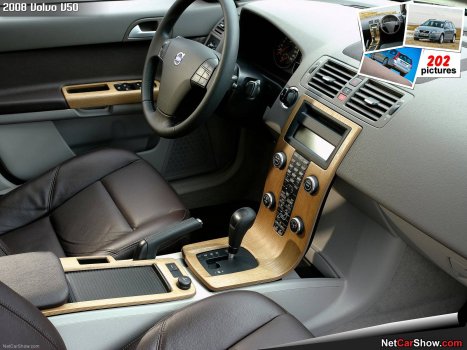
Interior design by most of the major automakers in the '90s left almost everything on the table, but that doesn't mean there are any easy fixes. You pretty much have to go fully custom while having some sense of harmonizing with what's already there.
It made me consider why wood dash kits are so awful in comparison, and I think it's because nobody would ever cut pieces for an entire dashboard center stack with elaborate cutouts for various openings of different sizes out of wood. Take this '02-05 Thunderbird dash kit for example:

Now take a look at Volvo, and keep in mind they can get away with things when using wood that the rest of the world can't because they're Swedish and it fits their cultural design language.

Interior design by most of the major automakers in the '90s left almost everything on the table, but that doesn't mean there are any easy fixes. You pretty much have to go fully custom while having some sense of harmonizing with what's already there.
Last edited:
At the risk of going all old man yells at cloud, monochromatic color interiors worked better on old classic cars. The 90s trend toward organic shapes with an absolute minimum of accent trim did these and other 90s era cars no favors. I have a hard time in faulting something like this with continuous green
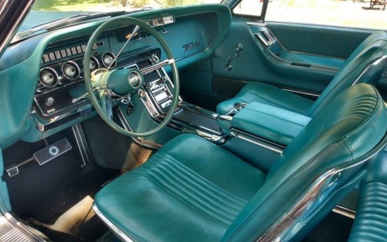
In modern interiors a lot of trim and accenting has come back since the 90s to break up the monotone look, but you never see anything like this anymore.
I agree on woodgrain, I don’t give a crap whether it’s a real wood veneer or a vinyl appliqué but if it doesn’t look plausible in the way it’s applied “carved” it gives off uncanny valley vibes.
MadMikeyL
Administrator
I’m sorry, I just can’t do the green interior, either in MN12s or in that old T-bird! Black or grey is my preference in everything. I still don’t even like the tan interior in my 97, but I’ve never had good luck with the interior dye holding up long term, so it will have to do, unless or until I get a parts car that has a complete grey interior in good shape.
When they removed all the interior accents with the MN12 refresh, all we were left with was just plastic. At least the Thunderbird still had the blackened cockpit trim panels. The Cougar was left with more monochrome and the driver side dashboard looks like a toy in certain colors.


NGL the first MN12 Cougar I almost bought had the tan interior and it kind of felt like I was sitting in a catcher's mitt
Totally agree on the Cougar colors, it's way too much.
Totally agree on the Cougar colors, it's way too much.
An all-tan Cougar interior could work, but you've really got to commit to the look and live with the quirkiness factor. Baseball glove thick-stitched upholstery seams everywhere. The most obvious place to start would have been the steering wheel. 
@Irv
Wood kits are awful indeed! I think the problem is that they are so 2-dimensional, i.e., flat. The MN12 kits are horrible. Plus there are so many pieces.
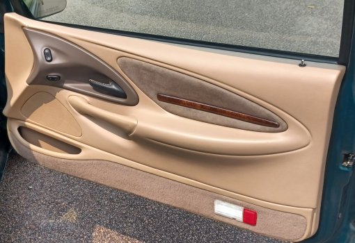
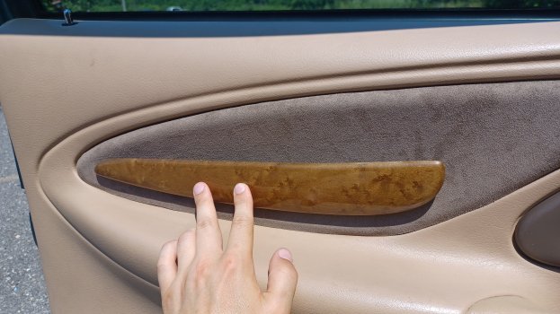
The wood pieces in my car are definitely an acquired taste. They break up the monotony in my opinion. I couldn't really imagine the interior without it anymore.
When they removed all the interior accents with the MN12 refresh, all we were left with was just plastic. At least the Thunderbird still had the blackened cockpit trim panels. The Cougar was left with more monochrome and the driver side dashboard looks like a toy in certain colors.


All that red in the Cougar makes it look a much more cozy place to be. Being a Mercury that was probably the interior design goal. Looks similar to early 90's Grand Marquis, inside they were an ocean of a mono color that is pleasing to the elderly.
IMO it looks good and adds to the coolness of having an older car.
The wood kits for cars of that era were pretty bad all around. The interiors of cars from back then had too many curves for some of the wood kit pieces to not look completely ridiculous or impossible. Worst of all was the adhesive.@Irv
Wood kits are awful indeed! I think the problem is that they are so 2-dimensional, i.e., flat. The MN12 kits are horrible. Plus there are so many pieces.
The wood pieces in my car are definitely an acquired taste. They break up the monotony in my opinion. I couldn't really imagine the interior without it anymore.
It's not even like I think the ones on your doors are bad by any means. I definitely see the intent there. Personally, if I wanted to go with wood accents, I would have done it for the entire ovoid panel. I also prefer the satin finish that Volvo uses on their wood accents more than the glossy ones that are everywhere else.
I would have done it for the entire ovoid panel. I also prefer the satin finish that Volvo uses on their wood accents more than the glossy ones that are everywhere else.
Well, I had limited resources to work with, and I do prefer the glossy finish. Early on I was experimenting with a maple finish from Jaguar, but I couldn't make it fit in a way I liked.
All that red in the Cougar makes it look a much more cozy place to be. Being a Mercury that was probably the interior design goal. Looks similar to early 90's Grand Marquis, inside they were an ocean of a mono color that is pleasing to the elderly.
IMO it looks good and adds to the coolness of having an older car.
In reality Ford primarily used Mercury as a repository for alternative Ford ideas. If you study the 89-93 interior progression they were going monotone on both Tbirds and Cougars. 93 either model practically set the stage for the 94 Cougars. 89s started with a lot more black pieces
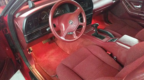
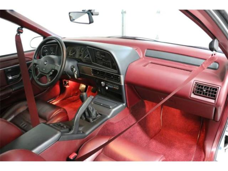
Cougars in those years actually had a different more square shaped shaped binnacle and lower dash trim than Tbirds so in 94 with the single dash shape they just split the color palate so Tbirds had black and Cougars had them matched
Last edited:
All that red in the Cougar makes it look a much more cozy place to be. Being a Mercury that was probably the interior design goal. Looks similar to early 90's Grand Marquis, inside they were an ocean of a mono color that is pleasing to the elderly.
IMO it looks good and adds to the coolness of having an older car.
I agree. I like a single color, albeit different shades of that color. The black instrument surround just looks like a generic one size fits all.
in 94 with the single dash shape they just split the color palate so Tbirds had black and Cougars had them matched
And then there was that absolutely unique 96 Saddle, where suddenly both Tbird and Cougar had matched pieces. Someone explain that.
The dash is dark enough where the black barely contrasts. I knew someone who put black bezels in a saddle interior and it just made it look busy
If there was a wood piece that had a leading edge with the same angle as the ovoid, it would look more like it was stock. But I actually like that asymmetrical piece more than a strip. The bottom edge of that piece contours nicely, but the leading edge again kind of does its own thing.Well, I had limited resources to work with, and I do prefer the glossy finish. Early on I was experimenting with a maple finish from Jaguar, but I couldn't make it fit in a way I liked.
View attachment 1207
To be fair, I think the wood on the refreshed Mark VIII doors looks a little out of place too even though the contours on it are pretty good relative to its visual boundaries.
I prefer the pre-refresh Mark VIII door's wood accents, but the post-refresh door card has nicer lines and textures overall rather than an imprint mold for 60% of the door's width.

If there was a wood piece that had a leading edge with the same angle as the ovoid, it would look more like it was stock. But I actually like that asymmetrical piece more than a strip. The bottom edge of that piece contours nicely, but the leading edge again kind of does its own thing.
To be fair, I think the wood on the refreshed Mark VIII doors looks a little out of place too even though the contours on it are pretty good relative to its visual boundaries.

I prefer the pre-refresh Mark VIII door's wood accents, but the post-refresh door card has nicer lines and textures overall rather than an imprint mold for 60% of the door's width.

Mercury never ended up seeing this to production but in the brochures and early press cars 1994 Cougars had wood trim inserts like this
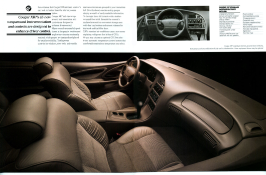
The dash is dark enough where the black barely contrasts. I knew someone who put black bezels in a saddle interior and it just made it look busy
But apart from that...why did they bother with Saddle for just one year, then introduce Light Prairie Tan for the last year. Seems like a waste of resources for colors which are so similar.
Derp, I think you're right. Thanks for nothing, Google Image Search.@Irv
That first gen Mark VIII strip is factory?! I've never seen that on any of them.
The second gen piece was somewhat my inspiration: putting the piece on top of the faux suede which has foam underneath, thereby producing that slight bulging effect all around it.
Well, if there was a place for a wood accent to go on the pre-refresh door card, it would have been there.
I don't know, but I wish they kept it going. I'm not a tan interior guy but I do really like that saddle two tone a lotBut apart from that...why did they bother with Saddle for just one year, then introduce Light Prairie Tan for the last year. Seems like a waste of resources for colors which are so similar.

